Interior Planning

I drew some sketches which show the new floor plan I intend to design, as well as the kitchen, bedroom and bathroom. With the bathroom design I want to cover the whole area with tiles as a mural, in my sketch I tested different colours as I have an idea of either a blue colour scheme or yellow/red, as a marble effect similar to Dale Franks work. I decided to cut down the walls in the bathroom so that the tile effect can successfully work without the space being too cramped.

With the wall that divides the bedroom and studio space, I want to replace the solid wall with a moire effect wall, so that it is semi transparent so you can see into the studio, which gives an illusions of the space being bigger, but also has an effect on the persons eye which ever way they walk, the wall changes pattern. I’ve decided to include this effect into my apartment because I don’t want the entire apartment to be purely based off certain colours or patterns that resemble Dale Franks work, I want to incorporate something different but which can also relate to his work. The moire effect can be associated with the aspect of movement that is within Frank’s paintings, as the moire wall moves with your eye as you move also, And in Franks work, the paints he uses move and mingle as he moves his canvas. In the kitchen area I’ve decided to cut the wall in half that divides the lounge and kitchen, and turn it into a bench top, so that the main space in the apartment is open and feels more spacious. With the other half of the wall being a feature that also resembles Frank’s work, which in natural light, can create a patterned effect of movement onto the kitchen bench top.

Week 5 – Layout Feedback

IMG_0619

Thursday’s in class exercise was similar to last weeks as we were asked to layout all our work to get ready for crit week, and go around the studio and give each other positive feedback and how to improve our final layout. I found this exercise extremely helpful as I collected a lot of constructive feedback, and agreed with all the feedback my peers gave me. It’s helpful to get another persons opinion on your work as they have a different view point than you, and may see things in your work that you don’t. I took this feedback in and improved my final layout and added more details and created a better result than my first attempt of my layout for week 6’s presentation.

Final Wall Design

Screen Shot 2017-08-12 at 12.07.00 PM

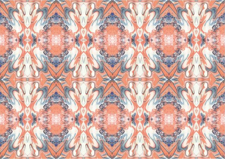
Wallpaper scaled as two 50cm width strips at 50cm length. Written Intent preparation for crit week:

I produced some paintings inspired by Dale Franks artwork in relation to his techniques and colours that he uses, and created some paintings and iterative models of my own. My process of designing a wallpaper includes selecting sections from my paintings and photographing the relationships within the paintings that interests me most.

My idea around the drawings was to incorporate colours together that Dale Frank uses in his paintings, using his technique of spilling paint mixed with varnish and tilting the canvas to swirl the colours together to show movement within the painting, which emphasise the main aspect of Dale Frank’s work. I also wanted to explore textures and how colours can collaborate with each other to create a contrasting pallet. My colour pallet is inspired by two of Dale Franks works, as I am interested in the oranges, blues and whites when they are mingled together. I then duplicated, reflected, and adjusted the photographs to create a repetitive pattern for my wallpaper.

My chosen wall in the apartment is the wall in the kitchen, as the colours and patterns i have chosen enhance a lively and creative atmosphere that i think is best suited in the kitchen where it is a place of movement and creativity. When rendering my design pattern onto the kitchen wall, I rotated the design so the pattern layout became vertical, so that it stretches out the wall and creates more sense of space and height within the kitchen. Moving forward with the design of the apartment, I intend to carry on using the same colour palette that was inspired from Dale Frank. As orange evokes excitement and enthusiasm, and in ancient cultures, is believed to heal the lungs and increase energy levels. Lighter shades of blue is considered calming and relaxing, which contrasts well with the warm orange. And white allows breathing space within the pattern so it’s not too overwhelming. I wanted the pattern to make you look at certain points in the design, to move your eye from one place to another, as if you were reading the design.


Peer Feedback

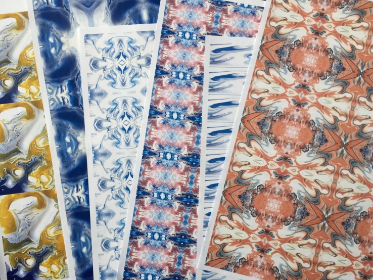
In Thursday’s class we were asked to bring in 6 initial design plans of our wall/window covering along with pictures of our artist models and drawings and models that we created in relation to our artist model. We also wrote up a summary of our work in relation to our artist models design research. As a class we were asked to individually go around and assessed each others work with written feedback about comparing each persons written intent in relation to their initial designs. The aim was to see whether or not the designs of each work were related to the aim of the artist models approach. This exercise was extremely helpful for me as I was able to see what my peers thought about my work and if they could see a resemblance of my designs within my artist model Dale Frank from another perspective than my own. I was glad to read that a lot of people thought my written intent was relative to my pattern designs and I got a lot of constructive feedback that enables me to move forward with my designs and improve to create a final outcome of a wall covering. Within my feedback sheets I found a variety of strengths, improvements and suggestions that people wrote which are…

Strengths:                                                                                                                                                – Relative to the ideas I have stated that I am exploring and to my artist model. – Plays with texture that Dale uses the most. – Shows repetition but also breathing room to expand out into a 3D textured design. – “The pattern makes you look at certain points in the design, it moves your eye from one place to another, as if you were reading the design.” – Looking at texture with paint, as paint isn’t always 2D

Improvements:                                                                                                                                       – Scale of the wallpaper in relation to the location. – Make more lucid patterns. “Dale Franks work doesn’t scream patterns as much as iterations would suggest.” – More information on the artist model an the colour pallet I have chosen – Be more specific about “techniques and colour” – More colour in the blue patterns, as the other ones explore colour collaboration, explore with more white spaces.

From reading this feedback on my work I am able to take it in and re-access my designs and adjust them to become better than my original design plans. I also have some good feedback on what I should include in my written intent for my wall covering so I am able to go back and re write it with the help from my peers, so that my work can all come together for crit week.


Week 4 – Wall Detail


IMG_0577

This week we were given the assignment of exploring the variety of techniques and colour approaches of our selected artist model and manipulating the research into the designing of either a wall or window detail covering. With my artist model being Dale Frank, I aim to incorporate  some aspects from his colour palette in some specific work he has done, intertwining these colours together by using his paint pouring and tilting technique, to create a pattern for a wall covering design. The colours Frank uses in some of his works that interest me are different shades of oranges, blues, yellow, pinks, reds and white. I also aim to explore textures and how colours can collaborate with each other to create a contrasting pallet that is aesthetically pleasing for the eye.

My process of designing a wallpaper includes playing with a range of different fragments selected from my drawings and paintings from last weeks exercise, and photographing the relationships within the paintings that intrigue me the most. From these photographs I converted them onto photoshop and duplicated, reflected, and adjusted them to creative a repetitive pattern for my wall design concepts. I find it challenging to predict how the scale of my design will look in repetition and on a larger wall, in comparison to what it looks like on photoshop, as I am wanting to create a design for the kitchen area in the bathroom. But I believe that when I do create the right scale, that the repetition will work with my pattern designs and hopefully I can create something that has flow and movement that can reflect that aspect of Dale Franks artwork.