Week 10 – Finished Tile Product

Above are photos of the finished products of my tiles after glazing, I’m pretty impressed with how they turned out as I really wanted them to resemble a marble effect. I was also impressed with how the colours came out as well, as I wanted to create a yellow, red and orange marbled tile as that is what I initially designed at the beginning of the tile process (picture below), not knowing how the tiles and colours would turn out, I think they came out better than what I was expecting considering the colour limitations in the workshop, although the colours are definitely not as bright and vibrant than my initial design I am still happy with the end result. 6666

Week 9 – Tile Glazing

This week’s tile workshop consisted of pulling our tiles out of the kiln ready to glaze. I was really impressed with how my tiles came out after the first kiln heating, as I wanted the marble effect that Dale Frank has in his art work, and these tiles display that really well. Before glazing the tiles, I added colour of yellow onto some white sections of the tiles to experiment and see how they would turn out in relation to the marble effect. I then decided to dip my tiles into clear glaze, so that after they come out of their second heating process, the colours are hopefully brighter and pop out more. As comparing my tiles now to how they were before the went into the kiln, the red clay is much more prominent than it was before it was heated.

Week 8 – Wet lab

FullSizeRender-3

Today we went to the wet lab and learnt about the tile creating process. For my final tile design I chose tile number 6 as I thought the colour palette from that design was most reflective of Dale Franks work. I realised during the learning that it isn’t too easy to create the exact design with the exact colours that I wanted. But I wanted to make a marble effect so I mixed together two lots of red and white clay, cut through the middle and rolled it flat which created the effect in the photo above. I experimented with different shapes and also engraved in some outer lines of the red clay to see what effect it would create after the firing stage. I found this process really exciting to make, to see how each roll of clay came out different from each other. Next week when we go back we will see the result of the tiles after the firing process, and will cover the tiles with glaze which will then go back into the oven for another firing process.

Tile Feedback

For today’s studio we were asked to bring in our tile design concepts for the apartment along with a written statement of intent to today’s class for a peer to peer feedback session. I found this useful as I was able to look at other people work and see how they constructed their tiles compared to mine. I collected a range of strengths and weaknesses from my peers on my work which is constructive feedback which I can then take away and re design and re write my statement of intent.

Strengths:

  • Clearly explored the similarities between my work and Dale Franks work, and stated my techniques to create my work.
  • Good placement in the apartment, fits well into the kitchen
  • Statement is understanding and clear
  • Explained the relationship and positioning, scale and glazing
  • Good articulation of colour and movement
  • Colours express a comfortable visual experience

Weaknesses

  • Talk more about the colour platte
  • How the artist used the colours
  • significance to my chosen space in the apartment
  • some colours together seem erotic and busy

Tile Design

For this weeks studio we were asked to construct multiple tile design concepts for the apartment along with a written statement of intent explaining our designs and relation to our artist model, my written intent for my design:

I produced some paintings inspired by Dale Franks artwork in relation to his techniques and colours that he uses, and created some paintings of my own. My process of designing tiles includes selecting sections from my paintings and photographing the relationships within the paintings that interests me most.

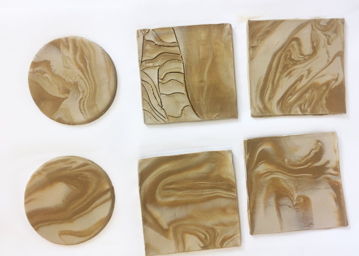
My idea around the drawings was to incorporate colours together that Dale Frank uses in his paintings but mainly the movement within the paint in Dale Frank’s work, using his technique of spilling paint mixed with varnish and tilting the canvas to swirl the colours together to show movement within the painting, which emphasise the main aspect of Dale Frank’s work. I also wanted to explore textures and how colours can collaborate with each other to create a contrasting pallet. When designing the tiles, I wanted to create a marble like effect that is displayed as a mural on the kitchen wall in the apartment, as the colours and patterns i have chosen enhance a lively and creative atmosphere that i think is best suited in the kitchen where it is a place of movement and creativity, as Dale Frank’s work resembles marble like effects, and his work is created by movement which is why I want to create a mural instead of a pattern as pattern repeat will restrict movement within the tiles.

The scale size of my tile concepts are 600 x 600 mm, because since it is a mural I wanted to create larger tiles that expand the image of the mural to create breathing space for movement, instead of smaller tiles which can make the mural seem flow and movement like. The tiles will have a polished finished so that the glazing of the polish express the colours within the tiles more than a matte finish would, also Dale Frank uses varnish in his paintings which creates a glossy look.

6666

55554444333322221111